Poslepu.cz na novém URL

Od ledna 2014 najdete blog na adrese poslepu.cz.

čtvrtek 28. února 2013

Google Accessibility Update - CSUN 2013 workshop

On Tuesday I attended the whole day workshop, called Google Accessibility Update, which was led by T. V. Raman and other at least 15 people from Google, including product managers of their core applications, internal accessibility evangelists and development staff.

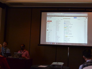
Google Accessibility Update workshop is starting

I really love Google services - my primary browser is Chrome, I use Gmail both on desktop and mobile, have phone with Android, etc. And I am really glad what enhancements Google did during past two years in a field of their products accessibility. There is of course still what to improve, but the progress is amazing.

Workshop covered all the major Google products and services - Chrome OS, Drive, Docs Suite, Gmail and Android and give us an overview about state of the art in this field.

A lot of work is being put into the Chrome OS to provide additional support for blind users via ChromeVox. The only way to make accessibility better is to simplify it at every level.

Every user has different needs and we need to build a customizable interface that works for everyone.

Chromebooks are cheap, boot in under 8 seconds, hassle- and maintenance-free. Just sign in with Google account. All your stuff is in the cloud. Accessibility is built-into OS at setup; spoken feedback provided via ChromeVox, user can also enable other accessibility features.

Google is now running Chromebook Accessibility Trusted Tester Program for individuals from USA, who will be provided with a Chromebook with the expectation to be active testers. It is a pity that this program isn't also in the Czech republic - I would apply immediately ;-)

Gmail was originally designed for sighted users, better support for blind users is a matter of the last few years. Now there is a extensive support for ARIA labelling, new features are tested manually and there are also automated tests for regressions. Nowadays there is a good support for keyboard-only users - you can use arrow keys, N and P keys and Enter to navigate between and within regions.

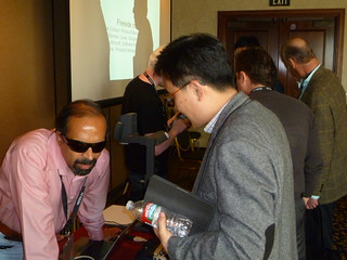
Google Accessibility Update - practical demostration of Gmail accessibility

Drive and Docs Suite accessibility is very closely related to ChromeVox. There are a lot of changes, for example keyboard interaction model in Drive is completely redesigned, focus management is improved or navigation itself is more consistent.

A lot of the keyboard accessibility features and new keyboard model is useful for people without disabilities as well (for example for me ;-)

New Accessibility for Google Apps were announced on this workshop.

Android brings completely unassisted setup, Jelly Bean 4.2 has accessibility shortcut, enabling to toggle TalkBack from anywhere using Power button. There is also a simple screen magnifier as a part of Jelly Bean 4.2 (triple tap to zoom in and interact while panning, triple tap and hold to zoom temporarily). This magnifier unfortunately does not magnify the keyboard.

In general, it is good to know that the best accessiblity experience on Android is with Jelly Bean.

A lot of practical and live demos were given by Google team members during the whole day - for example on Gmail, Google Drive on Android, Slides, Docs editor, etc.

Googlers were also asked a lot of questions. You can read them - together with answers and detailed notes - on Paul Schantz blog.

Google Accessibility Update workshop - discussion with T. V. Raman

Big thanks to Raman and his team (also for the T-shirt ;)

Related to this post

CSUN 2013 from my point of view

úterý 26. února 2013

Responsive Design and Accessibility - CSUN 2013 Workshop

This week (thanks to my great employer - Teiresias Centre at Masaryk University, Brno) I am attending CSUN 2013 Conference and workshops in San Diego, California. There are great sessions on agenda of the conference. The first one was a workshop on Responsive Design and Accessibility by Hans Hillen from The Paciello Group.

This workshop is/was really useful and important for all who think that web is only desktop (it is not), focus mostly on visual design and ignore all mobile devices.

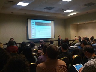
Crowded room during Responsive webdesign and accessibility workshop by Hans Hillen

Here are some notes and comments which I made during this session.

  • Mobile is not just phones, but all portable electronics (tablets, game consoles, TVs, ets.). It includes also native apps and of course mobile web.
  • Mobile accessibility means making a website or application more accessible to people with disabilities using mobile devices. The basics are the same as on the desktop: alternatives, labelling, good structure, native controls, content order.
  • Who we are talking about: 4 main user groups (vision, hearing, mobility, cognitive and learning), assistive technology users (screen readers, magnification), access services users (captions, subtitles, audio description), hidden disabilites (photo sensitivity, mental health), aging, temporary (broken wrist), cultural (language), technology (connectivity, particular SW and HW requirements), common ground between mainstream users and users with disabilities, empathy
  • Often, we have images of people with extreme disabilities in mind (totally blind, amputees, wheelchair users, totally deaf, etc), but many of us have mild disabilities (e.g. people who wear glasses) or hidden disabilities.
  • Constraints of Mobile Accessibility: small screen, small text size, small input devices and eyes-free usage, reliant on touch on handed usage, low light, connectivity and data limitations.
  • Capabilities of a Mobile Environment: better integrated accessibility than desktop, location and direction, camera and augmented reality, touch screen, environmental awareness (light/dark conditions) -> a lot of new possibilites.
  • Enabling Features and Innovations: app that helps color blind people identify colors, Apple’s Siri voice recognition, Google Voice’s voicemail transcription, Custom vibrations on iPhone and Android
  • Two Main Interaction Methods: Explore by touch and Gesture navigation.
  • Current Situation of Mobile Accessibility: iOS accessibility features and API are more mature, Android devices have some good accessibility features and Google are working to improve.
  • Principles of Accessibility for the Mobile Web:
    • Use progressive enhancement
    • Use a responsive design approach
    • Use web standards as intended
    • Support native accessibility settings and assistive technology for your target platforms
  • Mobile first: instead of building sites for desktop and degrading for mobile, focus on content and small screen then build up.
  • Use web standards as intended: accessibility is already “baked in” (buttons instead of styled divs)
  • Forms: using touch for inputing the content is difficult in general. Replace free input with more helpful controls. HTML5 input types bring Contextual keyboards in iOS/Android with useful buttons.
  • Responsive web design (RWD) is a web design approach aimed at crafting sites to provide an optimal viewing experience—easy reading and navigation with a minimum of resizing, panning, and scrolling—across a wide range of devices (from desktop computer monitors to mobile phones) - definition from Wikipedia.
  • Basically, responsive design means MEDIA QUERIES. Supported in all modern browsers (not in IE8).
  • General accessibility rules still apply in responsive design! Follow WCAG 2.0.
  • Responsive on Desktop. Very useful for low vision (or screen magnifier) users (it is not necessary to scroll horizontally).
  • Color Contrast: as a responsive page is modified between responsive break points, foreground may overlap background differently.
  • Hans prefers zoom over text-only resize over in page sizing controls.
  • Reading Order Problem: in some cases, the visual order of content is rearranged, while the structural order is not.
  • It’s fine to resize, reflow, filter and modify as long as the order of content stays consistent visually and in the document structure.
  • ARIA is supposed to be supported on mobile devices as well.
  • In some cases, a responsive switch may cause more than just a layout reflow.
    • Content can be filtered out.
    • Interactive controls may change into different types of UI (group of links may change into a dropdown button)
    • For a screen reader user it may not be clear that this change occurs
    • In this case - Notify user about it.
  • Data tables: very difficult to make accessible. Possible solutions - allow users to switch to the original version of the table or let them choose which columns will be displayed.
  • Responsive Design Can be confusing to inexperienced users, or users with specific expecations. Always allow users to switch to the default, desktop version of a site.
  • Guidelines and standards: There is no one set of internationally accepted mobile guidelines and standards. Mobile Accessibility Guidelines by Funka Nu
  • Make a test strategy: strategy by Henny Swan

Testing Mobile Accessibility on iOS

Workshop was really useful for me and although I know some presented topics very well, it gave me a comprehensive overview of the state of the art of this topic. On the other hand, I would really appreciate more practical examples such was accessibility of responsive data tables which was presented and discussed. I gave 4 stars from 5.

Thank you very much for this workshop, Hans.

středa 20. února 2013

My presentations at Universal Learning Design Conference 2013

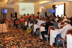
Universal Learning Design Conference 2013 was held in Brno last week and because I was there, here is a brief summary of what I did there. Conference provided an opportunity for a practical presentation of the universal design in tertiary education and a possibility to share experience with professionals who take care of the practical matters and thus technologically, organizationally, legally, linguistically, psychologically or pedagogically provide for the accessibility of the tertiary education.

I had two presentantions at the conference - the first one was a short talk on our proposals how to ensure accessibility of study materials, published at Masaryk University, the second one was a workshop on benefits of using HTML5 and WAI-ARIA to improve the accessibility of webpages.

How To Ensure Accessibility Of Documents, Published At Masaryk University

Although the vast majority of university students with special needs in the Czech Republic are students of Masaryk University, it is true that study materials are almost exclusively created and published with respect to the needs and preferences of students without special needs and without universal learning design principles. Changes, leading to the document accessibility, are often made only with an intuition and empathy and reflect only needs of particular student. Although this approach is quite common and authors consider it to be sufficient (and for the one particular moment of course it is), inclusion of accessibility principles in authoring process could bring much more benefits to all readers.

Our mission is to change this state and prepare a conception of complex universal learning design environment, in which following goals are reached according to the general standards and regardless this or that specific kind of accessibility is currently required.

Resources, in which study materials are published, and ways, how they are created, are very heterogeneous. Files are published in different formats (docs, xls, ppt, html, audio/video recordings), their technical quality varies and quite often they are full of (inaccessible) graphic objects.

The Support Centre for Students with Special Needs (Teiresias Centre) provides services for all students of Masaryk University with sensory and other disabilities. Its mission is to guarantee accessibility of all study programmes at Masaryk University.

Nowadays we quite often face issues connected with documents inaccessibility and although employees of Teiresias Centre very often moderate its impacts and we are able to prepare materials, meeting the accessibility requirements, there is still a lot what should be done to ensure better accessibility of study materials in general and make the preparation easier.

Current state is strongly influenced by a lot of factors – we focused mainly on human, legal and technical - you can see them on the slides.

Even though topic of accessibility of study materials is extremely wide, permanently influenced by a lot of factors and very often it´s not possible to find a simple way, how to ensure accessibility of study materials in general, some ways are quite easy to implement. And because they are already tested and used abroad (e.g. university web portal, concerning accessibility), there is no reason to start right with them.

How HTML5 and WAI-ARIA Can Improve Virtual Space of Universities

HTML5 and WAI-ARIA guidelines bring a lot of new ways and means how to create websites more accessible also to users with special needs. Although both of them are work in progress, it´s already possible to use some new functionalities which they bring to improve accessibility of websites.

Universities nowadays publish a lot of information by means of HTML and related technologies (CSS, Javascript, etc.). It includes their websites, study materials, registration forms or online tests. Although by these means it is possible to create an accessible HTML document, due to their limitations it is quite often necessary to use some workaround to ensure accessibility.

In this workshop, by way of practical examples, I presented some new features which these standards have and how they can help to increase the accessibility of universities websites. For example defining regions of the HTML document by WAI-ARIA landmarks allows defining not only the particular spots on the webpage, but the whole areas. Big advantage of this approach is that user knows, where is the beginning and where the end of the concrete region.

Although HTML5 is not yet an official standard and no browsers have full HTML5 support, all major browsers (Safari, Chrome, Firefox, Opera, Internet Explorer) are still adding support of new HTML5 features to their latest versions. The same – or maybe even better – situation is with a support of WAI-ARIA. This standard is widely supported in all major browsers and can be now easily used to improve quality of published content. So, there is absolutely no reason not to do it and you can only profit from using WAI-ARIA on your website.

Photos

I also took some snapshots at the conference. If you want, you can see them on my Flickr Account.

Universal Learning Design Conference 2013 on Flickr

úterý 19. února 2013

Nabízíte zajímavou službu či produkt pro uživatele se specifickými potřebami? Prezentujte je na konferenci INSPO

V sobotu 16. března proběhne v Praze další ročník konference INSPO. Přednáškové bloky už jsou sice obsazeny, ale pokud byste měli zájem o prezentaci Vašich služeb či produktů formou výstavního stánku, je k dispozici ještě několik volných míst. Poplatek za stánek je 2 000 Kč.

V případě zájmu kontaktujte prosím pana Jaroslava Wintera, hlavního organizátora konference, na e-mailu winter@brezen.cz.

Využijte tuto nabídku a oslovte 300 účastníků konference INSPO 2013. Mnozí z nich patří mezi uznávané autority ve svém oboru a mohou tak informace o Vašich produktech či službách dále šířit.

Související odkazy

sobota 16. února 2013

Praktické příklady implementace WAI-ARIA

Pravidelným čtenářům mého blogu jistě není metodika WAI-ARIA neznámá.

Ve čtvrtek jsem na konferenci ULD 2013 měl o přístupnosti HTML5 a WAI-ARIA workshop (ještě o něm napíšu), na které mně jeden z účastníků doporučil stránku s praktickými příklady, kterou jsem doposud neznal. Stránka se jmenuje velmi jednoduše - ARIA Examples - a je na ní spousta příkladů, ke kterým jsou k dispozici i zdrojové kódy. U některých příkladů je také možné měnit jednotlivé hodnoty a sledovat, jak se změny projeví na výsledku.

Pokud byste si je chtěli vyzkoušet v praxi, tak je třeba použít prohlížeč a screen reader, které specifikaci WAI-ARIA podporují. Osobně doporučuji kombinaci Mozilla Firefox a screen reader JAWS.

neděle 10. února 2013

Alt="", nebo Alt="{mezera}"?

To, že mají mít obrázky alternativní textové popisky, je známá věc. Pokud je obrázek dekorativní, je vhodné nechat atribut alt prázdný. Ale opravdu prázdný, tzn. nedávat do něj ani mezeru.

Je to proto, že grafický prvek, jehož atribut alt je prázdný (neobsahuje žádný znak), odečítače obrazovky zcela ignorují (tzn. uživatel vůbec neví, že se na stránce takový grafický prvek vyskytuje). A to je přesně to, co v takovém případě potřebujeme.

Pokud bychom do atributu alt vložili mezeru, pak některé screen readery budou uživatele v takovém případě o tomto grafickém objektu informovat slovem grafika, které se standardně používá právě jako upozornění na grafický prvek. Což není v danou chvíli žádoucí a uživatele to může spíše mást, jelikož už nedostane informaci o tom, co že je to za grafiku.

Jednoduchá rada tedy zní - pokud chcete, aby screen reader grafický prvek ignoroval se vším všudy (což je v případě dekorativní grafiky ideální varianta), nechte atribut alt opravdu prázdný (alt="") a nedávejte do něj ani mezeru.

Příklady

  • <img src="foto.jpg" alt="Popisek fotky."> - v tomto případě screen reader uživateli řekne grafika a přečte obsah atributu alt.
  • <img src="foto.jpg" alt=" "> - v tomto případě screen reader informuje o přítomnosti obrázku slovem grafika.
  • <img src="foto.jpg" alt=""> - v tomto případě je grafický prvek screen readerem zcela ignorován.

Související odkazy