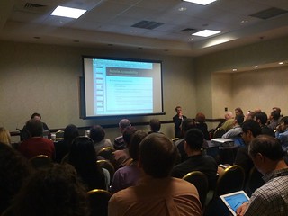
This week (thanks to my great employer - Teiresias Centre at Masaryk University, Brno) I am attending CSUN 2013 Conference and workshops in San Diego, California. There are great sessions on agenda of the conference. The first one was a workshop on Responsive Design and Accessibility by Hans Hillen from The Paciello Group.
This workshop is/was really useful and important for all who think that web is only desktop (it is not), focus mostly on visual design and ignore all mobile devices.
Here are some notes and comments which I made during this session.
- Mobile is not just phones, but all portable electronics (tablets, game consoles, TVs, ets.). It includes also native apps and of course mobile web.
- Mobile accessibility means making a website or application more accessible to people with disabilities using mobile devices. The basics are the same as on the desktop: alternatives, labelling, good structure, native controls, content order.
- Who we are talking about: 4 main user groups (vision, hearing, mobility, cognitive and learning), assistive technology users (screen readers, magnification), access services users (captions, subtitles, audio description), hidden disabilites (photo sensitivity, mental health), aging, temporary (broken wrist), cultural (language), technology (connectivity, particular SW and HW requirements), common ground between mainstream users and users with disabilities, empathy
- Often, we have images of people with extreme disabilities in mind (totally blind, amputees, wheelchair users, totally deaf, etc), but many of us have mild disabilities (e.g. people who wear glasses) or hidden disabilities.
- Constraints of Mobile Accessibility: small screen, small text size, small input devices and eyes-free usage, reliant on touch on handed usage, low light, connectivity and data limitations.
- Capabilities of a Mobile Environment: better integrated accessibility than desktop, location and direction, camera and augmented reality, touch screen, environmental awareness (light/dark conditions) -> a lot of new possibilites.
- Enabling Features and Innovations: app that helps color blind people identify colors, Apple’s Siri voice recognition, Google Voice’s voicemail transcription, Custom vibrations on iPhone and Android
- Two Main Interaction Methods: Explore by touch and Gesture navigation.
- Current Situation of Mobile Accessibility: iOS accessibility features and API are more mature, Android devices have some good accessibility features and Google are working to improve.
- Principles of Accessibility for the Mobile Web:
- Use progressive enhancement
- Use a responsive design approach
- Use web standards as intended
- Support native accessibility settings and assistive technology for your target platforms
- Mobile first: instead of building sites for desktop and degrading for mobile, focus on content and small screen then build up.
- Use web standards as intended: accessibility is already “baked in” (buttons instead of styled divs)
- Forms: using touch for inputing the content is difficult in general. Replace free input with more helpful controls. HTML5 input types bring Contextual keyboards in iOS/Android with useful buttons.
- Responsive web design (RWD) is a web design approach aimed at crafting sites to provide an optimal viewing experience—easy reading and navigation with a minimum of resizing, panning, and scrolling—across a wide range of devices (from desktop computer monitors to mobile phones) - definition from Wikipedia.
- Basically, responsive design means MEDIA QUERIES. Supported in all modern browsers (not in IE8).
- General accessibility rules still apply in responsive design! Follow WCAG 2.0.
- Responsive on Desktop. Very useful for low vision (or screen magnifier) users (it is not necessary to scroll horizontally).
- Color Contrast: as a responsive page is modified between responsive break points, foreground may overlap background differently.
- Hans prefers zoom over text-only resize over in page sizing controls.
- Reading Order Problem: in some cases, the visual order of content is rearranged, while the structural order is not.
- It’s fine to resize, reflow, filter and modify as long as the order of content stays consistent visually and in the document structure.
- ARIA is supposed to be supported on mobile devices as well.
- In some cases, a responsive switch may cause more than just a layout reflow.
- Content can be filtered out.
- Interactive controls may change into different types of UI (group of links may change into a dropdown button)
- For a screen reader user it may not be clear that this change occurs
- In this case - Notify user about it.
- Data tables: very difficult to make accessible. Possible solutions - allow users to switch to the original version of the table or let them choose which columns will be displayed.
- Responsive Design Can be confusing to inexperienced users, or users with specific expecations. Always allow users to switch to the default, desktop version of a site.
- Guidelines and standards: There is no one set of internationally accepted mobile guidelines and standards. Mobile Accessibility Guidelines by Funka Nu
- Make a test strategy: strategy by Henny Swan
Testing Mobile Accessibility on iOS
Workshop was really useful for me and although I know some presented topics very well, it gave me a comprehensive overview of the state of the art of this topic. On the other hand, I would really appreciate more practical examples such was accessibility of responsive data tables which was presented and discussed. I gave 4 stars from 5.
Thank you very much for this workshop, Hans.

3 komentáře:
Moc pěkné, ale proč, prosím, to není česky? Pro nás blbce, kteří sice mluvíme čtyřmi jazyky, ale angličtina mezi nimi není (pouze lehce, okrajově)…
Protože ten workshop byl v angličtině a dělal jsem si poznámky anglicky. Ale v češtině mám o CSUNu také v plánu něco napsat, takže si na své přijdou i ti, kteří češtinu preferují.
Díky, budu se těšit na české povídání, téma je to zajímavé :-)). Ten anglický text jsem v hrubých rysech sice přelouskal, ale přece jen má "angličtina" není natolik dobrá, abych všemu porozuměl…
Okomentovat